Restroom signage that clears code while offering elevated design
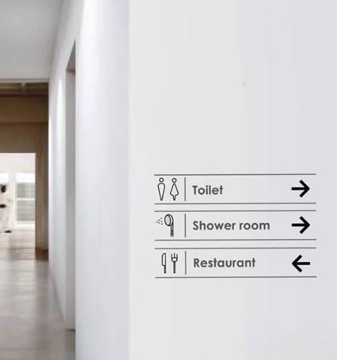
Good wayfinding is judged by how little you notice it. A corridor strip pairing simple pictograms with directional arrows for toilet, shower room, and restaurant does exactly one job getting someone unfamiliar with the space to the right door with the least possible hesitation. No branding, no color hierarchy competing for attention, just fast legibility built into the layout itself.
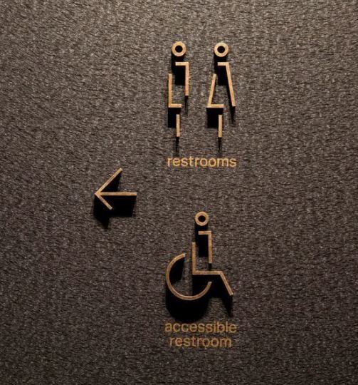
Restroom signage tends to get less design attention than almost anything else in a building, largely because it’s required regardless of budget. Most spec packages default to a flat vinyl decal that meets code and nothing more. Etched brass pictograms with real shadow depth meet the exact same ADA requirement on the exact same amount of wall space, and the result reads entirely differently. It’s a useful reminder that a mandatory line item and a well-designed one aren’t mutually exclusive, the gap between them is often just a material choice.
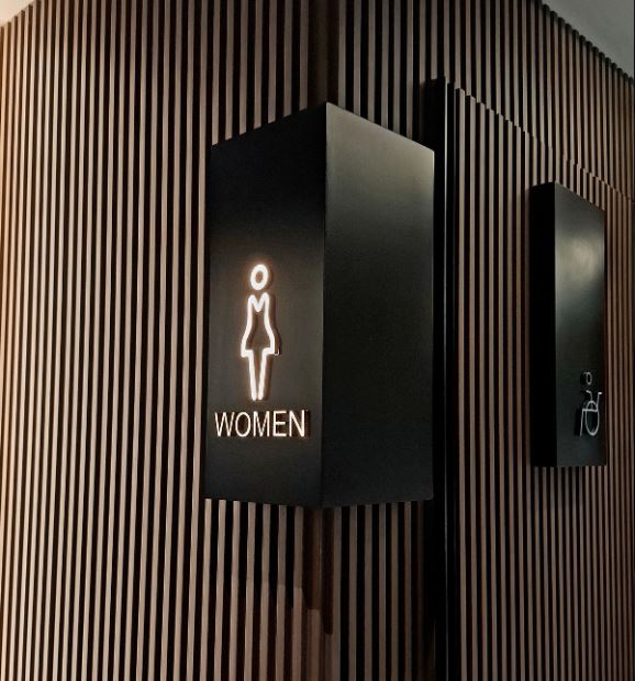
Distance and light change what wayfinding needs to do. An illuminated sign box with a backlit pictogram solves a problem the other two examples don’t have to, staying legible from across a dim corridor or lounge, where a flat wall decal would disappear. Raised off the wood slat wall behind it, the fixture doubles as an architectural moment rather than reading as a sign bolted on after the fact.
THE TAKEAWAY:
Signage sits in a rare spot, required by code and read by essentially everyone who moves through a space. That combination makes it one of the highest-leverage details in a project: inexpensive relative to the whole budget, impossible to avoid seeing, and just as easy to treat as an afterthought as it is to get genuinely right.
 BUILT TO NOTICE